Thursday 2 April 2015

Rationale

Our emergency is hikers who get lost or injured while on a hike in the New Zealand bush and can't complete the track. Our target audience is tourists and beginners who won't necessarily be properly equipped or knowledgable about the New Zealand bush

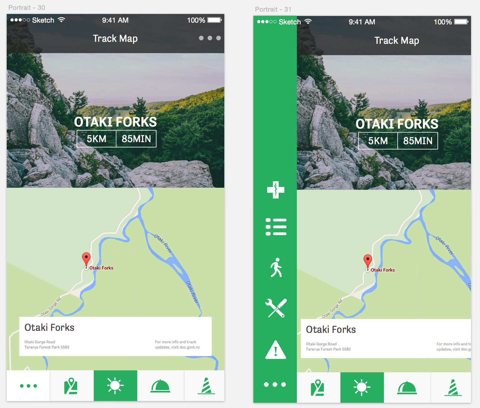
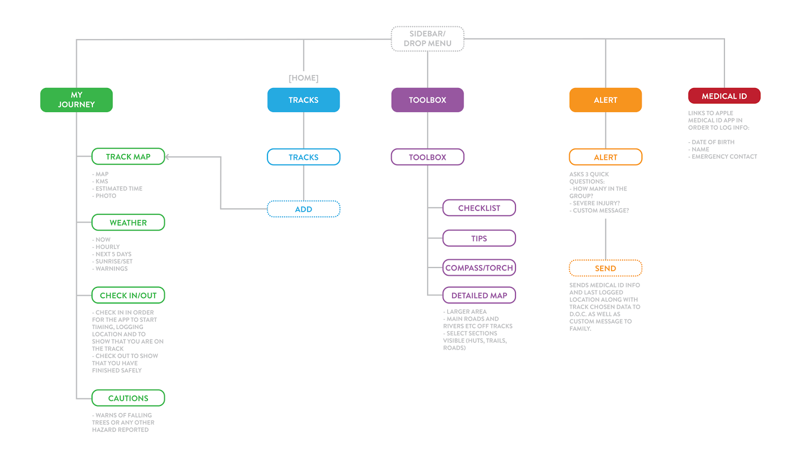
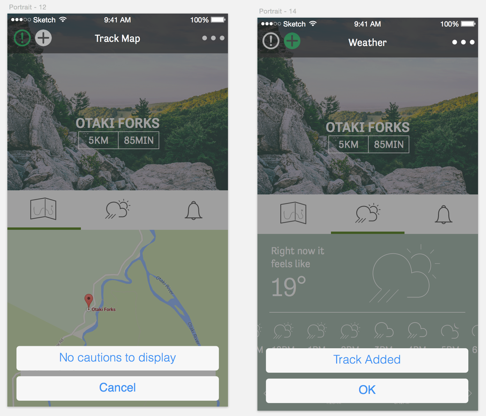
Our app focusses on the before and during. One section focuses on the journey and the before. You will pick the track you are going on in order to access information about weather, hazards and a map specific to the track chosen. One of our biggest ideas is the check in/check out function. As you start the hike you would check in by using the fingerprint scanner (to easily verify identity) which would log your Medical ID information and track in the Search and Rescue system. This allows the Search and Rescue team to know how many people are on the track in case something was to happen such as a sudden, unexpected weather change. It also means that they will have medical information about you such as; name, blood type, allergies, age etc. (you will be prompted to complete this before checking in. Once checked in the app will ping your location via GPS so that if anything were to go wrong they would know your last known/current location on the track. The app will also be timing your hike so if you have not checked out within the 2 hour grace period (dependant on track length) then they will know something is wrong and attempt to make contact with you.

Another section is mostly about tools used during and contains a checklist, a short tips guide, a torch, a compass and a larger, more detailed version of the map which includes huts, roads etc. The checklist contains a short list of items invaluable to the hike and the tips guide provides tips on hiking such as; packing lightly, wearing suitable boots and choosing the right hike.  The torch uses the light function on the phone incase the user is forced to stay overnight. The compass uses the GPS and gyroscope functionality to show you which way is North so that the map can be utilised properly.

The last section is an alert sender that's purpose is to send out an alert rather than the user waiting for the check in timer to alert Search and Rescue which could be hours away. It contains one simple screen which asks two multi choice questions and has the option for an added message in order to combat the panic a user may be feeling during this time. The alert screen asks how big the group is (1, 2-5 or 5+), if there are any injuries (yes or no) and if you would like to add a custom message to provide any extra information. The alert then sends the information via phone signal when possible to the Search and Rescue team and will then display a push notification when the Search and Rescue team have come up with an estimated rescue time. It includes the user's Medical ID and chosen track information.

Overall the app is simple to use and contains various useful information for before and during a hike that would definitely benefit a tourist or beginner in a variety of situations. The app is very simple and straight forward when it needs to be (within the alert sections) and in general is easy to navigate and find the information or tool needed. The app uses multiple sensors such as GPS, phone signal, light, fingerprint scanner, gyroscope, location services and information logging in order to create a useful but not too overwhelming guide for hikers.

Final App Design

To view our app, click the link here: https://beta.atomic.io/d/1rNjpTQhwhP

Note: This was made in Atomic which is in beta, it may be a bit laggy but it's all there. To view best/smoothly we recommend viewing it in Google Chrome.

Wednesday 1 April 2015

Designing and tinkering with more screen states


1. Tips section

We wanted the tips section to be really easy to navigate and quite intuitive. We decided to base the design off the common iOS introduction to app design, which users often see when they open a new app. Cards are used to communicate walk throughs or simple steps, where swipe left/right lets the user navigate through the different states.


2. Menu design and icons
It was really important to us to have a menu so that the user always knew where they were in the app and could easily navigate throughout the section of the app in one tap. We had originally placed the menu up in the centre of the screen but soon realised that this was a difficult place for the user to reach with their thumb. We decided to bring it down to the bottom centre of the screen for easy and intuitive navigation, using a green square to highlight where they were so they always knew what they were looking at and could easily navigation between.

We needed to source some more icons for our menu. Again we wanted quite recognisable icons that were familiar and assisted the user in navigation throughout the app. 


3. Checklist and tools


4. Alert section

We went through quite a few variations of the alert screen. The challenge was to keep it simple and easy to digest. We switched from being text based to icon based to back to text based again. The problem we found with the icons were that they were a bit too difficult to understand or interpret. What if you have a party of two? Then you don't into any category - we found it was too specific. We also decided that we didn't want to confuse users with their various interpretation of what kind of injury they had. The main concern that Search and Rescue would need to know is if they are injured yes/no, and they often come prepared to assistant in survival if necessary. 

We opted for orange as a colour scheme for this section a we wanted it to be very obvious that they were in the alert/emergency section of the app. We felt that green wasn't serious/distinguishable enough and red was too harsh and only add more stress. 

Another element we used to make it obvious they were in the alert section was the drop down coloured bar, similar to what you get on iOS when your phone is broadcasting a hotspot. This is to alert the user of the whereabouts in the app. 

Of course it is important that the user can navigate back to anywhere in the app, so we ensured that the menu was included down the bottom left.


Final Design choice:


Tuesday 31 March 2015

Wednesday 25 March 2015

Exploring states, transitions and implementing user feedback

1. Home screen state

The home screen state is the track list as we want to encourage the user to select their walk before they go on the walk. In the first mockup (on the right), the alert and emergency tools could only be accessed by selecting the three dot drop down on the top right. During user testing we got feedback that they weren't sure where to go to get to the emergency section as it was hidden. We've pulled the alert icon out of the drop own and added it to the home screen as a floating button on the bottom right. This means that the user can get to this section in one click rather than two. 


2. Experimenting with iOS UI guidelines

We want to incorporate some of the iOS UI and guidelines as we feel that they are familiar to our users, therefore don't complement the navigation of the app in a stressful situation. In our first mockup, we tried the 'list UI' from iOS 8, however realised that this was the incorrect use for this UI as it is reserved for lists rather than confirmations/modals. We revisited the UI and found the correct iOS 8 UI for our situation which is shown in the second image.


Incorrect iOS guidelines


Correct iOS guidelines


3. Exploring placement and design of caution/warning section
We want the user to be able to see any warnings or caution areas before/during their walk so that they can be prepared to encounter them. We first had this as it's own menu in the top left of the track screen, however user feedback was that it wasn't entirely clear what/where it was. Instead it was suggested that we bring it down to the nav UI in the centre of the screen with the other icons. It was raised that the user felt this had equal importance to the other sections, so felt that it belonged in that group.


Original


Revised with user feedback


4. Main navigation UI

We had some mixed feedback about the menu nav and UI of our app. Some thought they the drop down hover was too small and were afraid that they would accidentally tap the wrong one or that their thumb was too big. We experimented by bringing in a more modal nav UI where the nav slides in from the right. The feeling however was that this was too big and not in line with the style of the rest of our app. In the end we opted to increase the size of the drop down so that it is more accessible.


4. Selected track nav


Once the user has selected the app, there is quite a bit of information that we would like to communicate. We feel that the best way to do this is by having a secondary nav where the info can be accessed by swiping the bottom of the screen. This keeps the information really clear as it gets full priority when selected, rather than cramming all the info together on one screen/state. We went through a couple of design tweaks to get the best solution.


5. Ability to add a walk from the track list

One of the feedback was that the user wanted the ability to add a walk to their journey from the track list rather than having to click in each time. We've added an 'add' button to facilitate this.

Original


Revised


6. Improved navigation


We decided to revisit the navigation we were using the the My Track page as we felt that it was in not a very friendly user spot. We also wanted a way to incorporate the main menu nav into this navigation to make it accessible any time. Consistency is important so we wanted to create a menu navigation that could be carried across the entire app, and added the medical ID. We also played with scale and adding filled icons rather than outlined strokes.

Large scale/buttons


Smaller scale/buttons 


7. Tweaks to the weather section

We made some tweaks to the weather section by adding some more heavy weighted icons and altering the hierarchy slightly, getting rid of some of the distraction and clutter.


Tuesday 24 March 2015

User testing and feedback

Feedback points

- are the icons in the selected track page clickable? What are they? The need to seem more buttony/clickable

- caution could be another icon at the bottom. At the moment the bell looks like a warning sign rather than check in/out

- should have the ability to add the walk from the track list rather than only once clicked into the track

- want to be able to access the toolbox form the warning/cautions as it's likely that I may need a tool when at the caution area

- from selected walk, the caution button seems like an emergency

- drop down menu seems to small, maybe a full page nav?

- track screen has a lot of info to take on, what am I looking at?

- try filled/coloured icons rather than outlined

- scroll instead for track screen? Less info at a time?

- ability to access emergency from home screen

Newly Developed Sitemap


Once we began designing the app and all the different sections we realised that there were navigational issues that we hadn't considered. We ended up moving elements around to improve the overall flow and ease of use; Keeping the 'Alert' section very separate and extremely quick to cater for panicked users, and separating all the track-specific elements into the 'My Journey' sector while the generic tools and tips are in the 'Toolbox'.