Tuesday 31 March 2015
Wednesday 25 March 2015
Exploring states, transitions and implementing user feedback
1. Home screen state
The home screen state is the track list as we want to encourage the user to select their walk before they go on the walk. In the first mockup (on the right), the alert and emergency tools could only be accessed by selecting the three dot drop down on the top right. During user testing we got feedback that they weren't sure where to go to get to the emergency section as it was hidden. We've pulled the alert icon out of the drop own and added it to the home screen as a floating button on the bottom right. This means that the user can get to this section in one click rather than two.

2. Experimenting with iOS UI guidelines
We want to incorporate some of the iOS UI and guidelines as we feel that they are familiar to our users, therefore don't complement the navigation of the app in a stressful situation. In our first mockup, we tried the 'list UI' from iOS 8, however realised that this was the incorrect use for this UI as it is reserved for lists rather than confirmations/modals. We revisited the UI and found the correct iOS 8 UI for our situation which is shown in the second image.
Incorrect iOS guidelines
Correct iOS guidelines

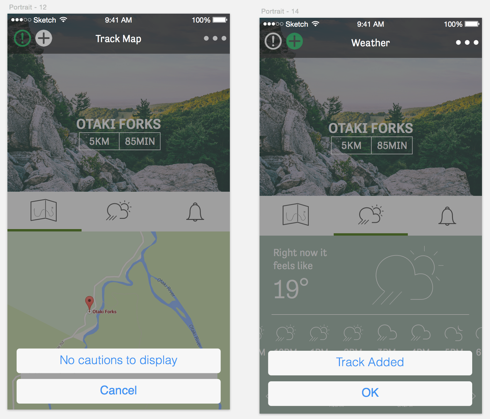
3. Exploring placement and design of caution/warning section
We want the user to be able to see any warnings or caution areas before/during their walk so that they can be prepared to encounter them. We first had this as it's own menu in the top left of the track screen, however user feedback was that it wasn't entirely clear what/where it was. Instead it was suggested that we bring it down to the nav UI in the centre of the screen with the other icons. It was raised that the user felt this had equal importance to the other sections, so felt that it belonged in that group.
Original

Revised with user feedback

4. Main navigation UI
We had some mixed feedback about the menu nav and UI of our app. Some thought they the drop down hover was too small and were afraid that they would accidentally tap the wrong one or that their thumb was too big. We experimented by bringing in a more modal nav UI where the nav slides in from the right. The feeling however was that this was too big and not in line with the style of the rest of our app. In the end we opted to increase the size of the drop down so that it is more accessible.

4. Selected track nav
Once the user has selected the app, there is quite a bit of information that we would like to communicate. We feel that the best way to do this is by having a secondary nav where the info can be accessed by swiping the bottom of the screen. This keeps the information really clear as it gets full priority when selected, rather than cramming all the info together on one screen/state. We went through a couple of design tweaks to get the best solution.


One of the feedback was that the user wanted the ability to add a walk to their journey from the track list rather than having to click in each time. We've added an 'add' button to facilitate this.
Original

Revised

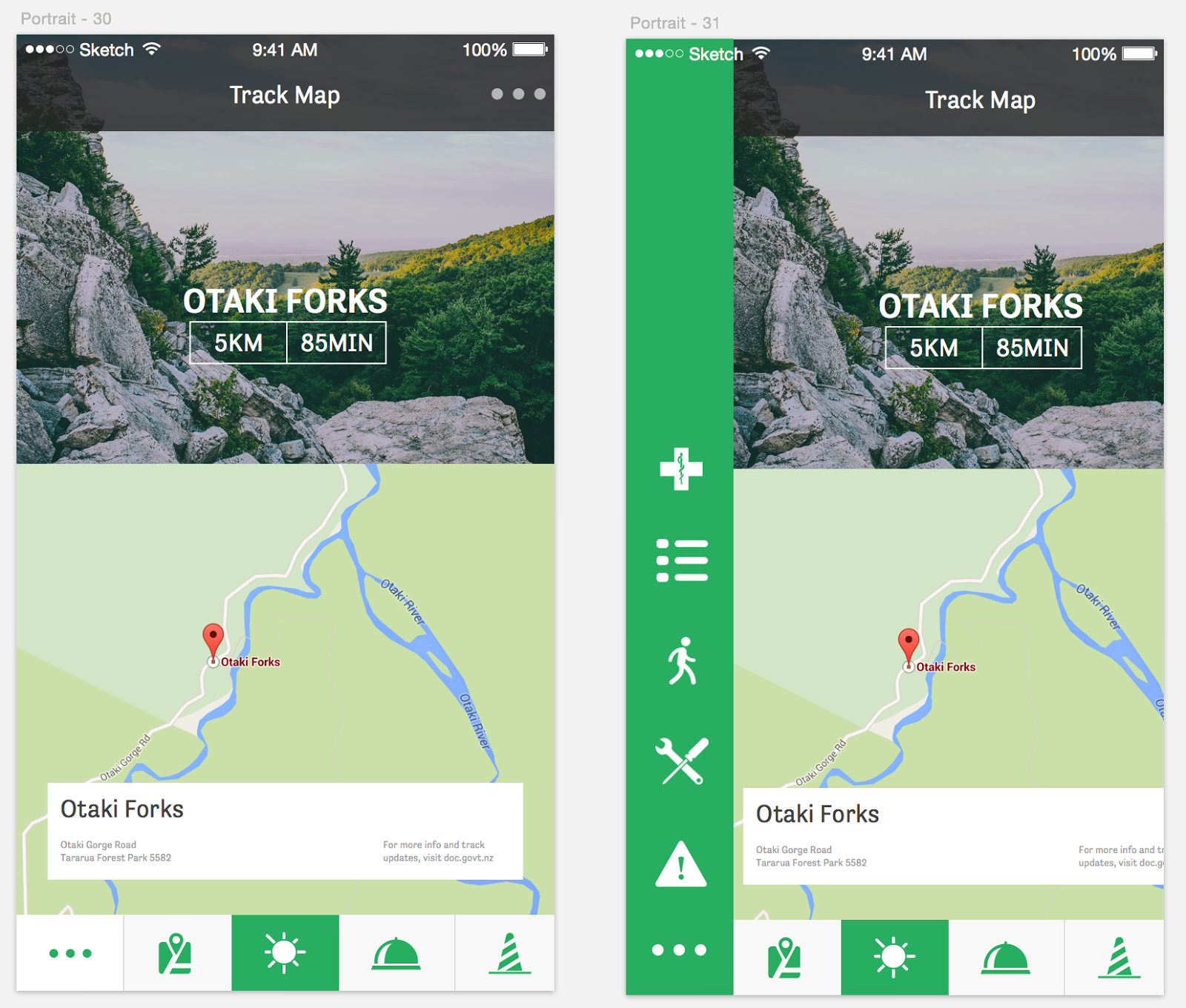
6. Improved navigation
We decided to revisit the navigation we were using the the My Track page as we felt that it was in not a very friendly user spot. We also wanted a way to incorporate the main menu nav into this navigation to make it accessible any time. Consistency is important so we wanted to create a menu navigation that could be carried across the entire app, and added the medical ID. We also played with scale and adding filled icons rather than outlined strokes.
Large scale/buttons

Smaller scale/buttons
We made some tweaks to the weather section by adding some more heavy weighted icons and altering the hierarchy slightly, getting rid of some of the distraction and clutter.

Tuesday 24 March 2015
User testing and feedback
Feedback points
- are the icons in the selected track page clickable? What are they? The need to seem more buttony/clickable
- caution could be another icon at the bottom. At the moment the bell looks like a warning sign rather than check in/out
- should have the ability to add the walk from the track list rather than only once clicked into the track
- want to be able to access the toolbox form the warning/cautions as it's likely that I may need a tool when at the caution area
- from selected walk, the caution button seems like an emergency
- drop down menu seems to small, maybe a full page nav?
- track screen has a lot of info to take on, what am I looking at?
- try filled/coloured icons rather than outlined
- scroll instead for track screen? Less info at a time?
- ability to access emergency from home screen
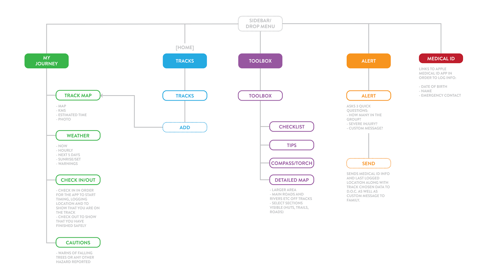
Newly Developed Sitemap

Once we began designing the app and all the different sections we realised that there were navigational issues that we hadn't considered. We ended up moving elements around to improve the overall flow and ease of use; Keeping the 'Alert' section very separate and extremely quick to cater for panicked users, and separating all the track-specific elements into the 'My Journey' sector while the generic tools and tips are in the 'Toolbox'.
Monday 23 March 2015


Friday 20 March 2015
Checklist

We feel that huge checklists are unrealistic and unnecessary for a beginner hiker so we are going to cut down the checklist to be something a bit more digestible like the amount of items shown in these pictures:


Thursday 19 March 2015

Wednesday 18 March 2015


Tuesday 17 March 2015
Rough design mockup


We began free-ling bringing out paper prototypes into a digital environment and started adding some rough design elements to get an initial feel of how the app UI and UX might work together. Here's some screenshots and a video of our first, initial design exploration:
View the prototype at: https://beta.atomic.io/d/1zz5Eu2hrhP


Prototype test
Just testing design, style and potential transitions and layout. View at: https://beta.atomic.io/d/1NGLnf8hMh9


